
POS Dashboard
This project was part of my work at a company, where I designed a dashboard feature for a point-of-sale application.
My role
I worked as the UX/UI Designer, responsible for translating business requirements into the dashboard’s user experience and interface.
I collaborated closely with the Business Analyst to clarify requirements and with developers to ensure the designs could be implemented as intended.
The brief
The POS already had a start screen, but it mainly served as a collection of navigation buttons. It didn’t give cashiers an overview of the day’s activity or highlight tasks that needed their attention.
Before: primarily navigation

The goal was to transform the start page from a simple navigation screen into an actionable dashboard — giving cashiers a quick overview of the day’s activity, surfacing tasks that required attention, and providing access to key actions from one place.
The dashboard needed to bring together:
Today's performance
KPIs and charts such as average transaction value and returns rate
Tasks requiring attention
Pending orders, shipments, documents on hold, and other unfinished activities
Store manager assignments
Tasks assigned to staff by a store manager
Designing for touch
The experience needed to work across touchscreen POS terminals and Zebra mobile devices. With limited screen space and no hover states, the design relied on appropriately sized, touch-friendly controls and responsive layouts.

From requirements to experience
The requirements defined what information the dashboard needed to show and how it should be grouped, but left the presentation largely open. My role was to turn those requirements into a structure that fit the existing POS experience and allowed cashiers to quickly understand what needed their attention.
Structuring the dashboard
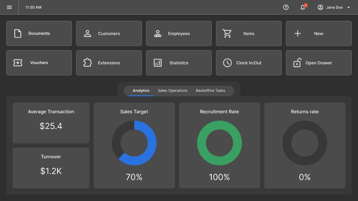
I organized the dashboard into three tabs, each focused on a different type of information:

Analytics
Today's performance, KPIs, and charts.

Sales operations
Pending orders, documents on hold, and cash drawer status.

Backoffice tasks
Inventories, shipments, and staff assignments.
From information to action
I treated the dashboard as more than a place to display information. Wherever possible, information representing unfinished work became an entry point to the relevant workflow.
For example, pending orders and documents on hold take the cashier directly to the corresponding list of pending items. The cash drawer card also provides an Adjust cash action when the amount falls outside the expected limits.

Working within the design system

The existing POS design system provided patterns such as tabs, buttons, and icons, which I reused to keep the dashboard consistent with the rest of the application.
However, the system didn't have a suitable card component, so I designed a new card pattern specifically for the dashboard.
Key design decisions
Keeping the dashboard scannable
I initially considered a traditional vertically scrolling dashboard, but this didn’t fit the way the rest of the POS worked. The application deliberately avoided full-page scrolling, using scrolling within individual containers instead.
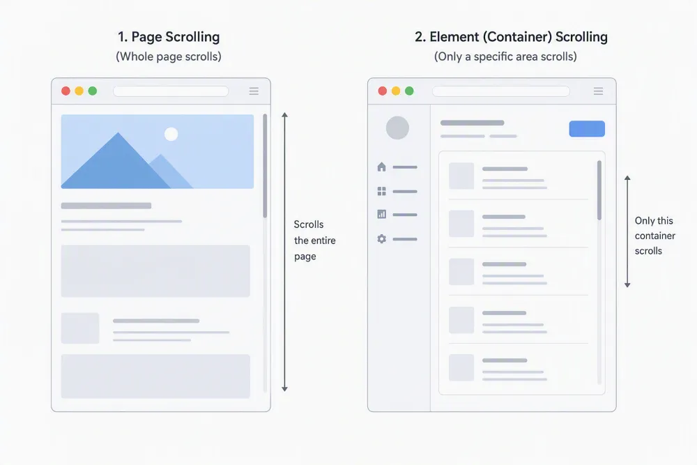
This kept the dashboard consistent with the existing interaction model while allowing the cashier to switch between clearly defined areas without losing the overall context.
Assignments in a side panel
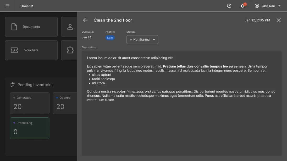
The project also introduced a system for store manager assignments. Rather than treating assignments as another dashboard metric, I designed them as an actionable layer accessible from the notification bell in the top bar.

The side panel gives cashiers a dedicated place to review their assignments and manage their status — for example, marking an assignment as in progress or completed — without taking them away from the current POS screen.
Highlighting overdue assignments
The original requirements stated that overdue assignments from store manager should disappear once they expired. I challenged this behavior because removing them would hide information that could still be important to the cashier.
Instead, I proposed keeping overdue assignments visible and making them visually prominent, using red to signal their urgency. After discussing this with the Business Analyst, the requirement was changed accordingly.

Final design
The final design brings the dashboard requirements together into a single experience across desktop POS terminals and mobile Zebra devices.
Below are the desktop mockups, showcasing the complete dashboard experience:


And here’s a peek at the mobile experience, adapted for smaller touchscreens:


Outcome & reflection
The dashboard design was completed and incorporated into the broader POS product, but the product did not ultimately reach release. As a result, there was no opportunity to validate the design with end users or measure its impact. However, the work may be revisited for a future release and gave me valuable experience translating business requirements into a cohesive experience within an POS product.
Lessons learned
Designing for touch
Designing for POS terminals and mobile Zebra devices required a different approach from traditional desktop interfaces. I had to account for larger touch targets, clear visual states, and interactions that didn’t depend on hover, while maintaining a compact and efficient layout.
Collaborating with business stakeholders
Working closely with the Business Analyst taught me to go beyond simply implementing requirements and actively contribute to the experience. One example was challenging the decision to hide overdue assignments and proposing a more visible treatment instead — a change that was ultimately accepted.
Designing within an existing system
The project also strengthened my ability to extend an existing design system without breaking its consistency. I reused established patterns where possible while introducing new components, such as the dashboard cards, where the existing system didn’t provide a suitable solution.
Note: Some decorative visuals in this case study were AI-generated for presentation purposes.