
ERP Side Panels Redesign
At Comarch, I was assigned to the redesign of Comarch ERP Enterprise (CEE) — a large, mature ERP system used daily by professionals who process thousands of documents: sales orders, deliveries, invoices. We were a team of two designers — a senior UX designer and me — and the effort began with the Sales Order demo: a redesign of the Sales orders feature, built on the Comarch Design System.
Most of that groundwork was in place before I joined. Once on board, I worked on the redesign alongside my teammate. This case study covers my work on the side panel system, internally known as dockable views.
The context
Why a redesign? CEE has grown with its market for many years, and the current interface shows its age: outdated visuals, unintuitive interactions, and functionality hidden behind cryptic icons. Earlier user research confirmed the cost — users spend a lot of time just learning the application.
One look at the current interface shows why. It is extremely information-dense, with no clear page hierarchy — every control carries the same visual weight, so nothing guides the eye. The layout isn’t something a user can figure out; it has to be learned:

A broader redesign initiative was already underway: a new, modern layout for the Sales orders area had been proposed, refreshing the visual language and navigation:

The demo was still being improved upon, with a lot of areas left to polish — one of them being the side panels. In CEE, panels are how users reach contextual tools without leaving their work — search, messages, tasks, favorites, and more. They are opened from icon toolbars docked to the edges of the screen — right, left, or bottom — and can be pinned and resized.

The challenge
The task was bigger than a facelift. It fell into three parts:
1) Redesign dockable views
Rethink the panel system as a whole — its logic, behavior and look — and bring it into the new design language.
2) Redesign the Linked documents panel
The panel that shows a document's whole chain — originally called Voucher references chain — is essential for Sales orders and needed a redesign of its own.
3) Design the table data organization panel
Multi-sort, grouping, and a home for the rest of the filters were a must for the redesigned list. I proposed a new dockable view for all three.
My role
Interaction Designer
UI Designer
I was responsible for the UX and UI design of the panel system within the Sales orders redesign. This included auditing the current dockable views, defining the interaction model (opening, closing, pinning, resizing, splitting), and designing the panel components. I also designed two specific dockable views: the table data organization panel and the linked documents panel. All of this work was documented in specification for designers and developers.
Redesigning the panel system
Working through the existing panels, a few recurring problems stood out:

Destructive close
The X button didn't just close a panel — it also removed its icon from the toolbar. To users, the feature simply vanished.

Buried configuration
Toolbar configuration was hard to find and unintuitive — general and app-specific views were persisted globally, even though app-specific ones exist per application.

Confusing pinning
The pin icon and its logic were confusing: a pinned panel behaved like a floating window, with its icon disappearing from the toolbar.
I started from the foundation: the anatomy of the system — the icon toolbar as the single entry point, and the panel with its consistent structure and elements.

The toolbar hosts two kinds of views: general ones, shared by all applications — like messages, favorites or history — and app-specific ones that exist only in a given application, like linked documents in Sales orders. Previously the two were mixed together even though they work differently — now they are clearly separated on the toolbar.
Configuration you can find
Configuration now lives where users expect it. Each toolbar has a settings menu where users simply toggle which views are visible.
Toolbars layouts operate on a bigger scale: one layout saves the configuration of all toolbars, with general views persisted across all applications and app-specific ones per application. That’s why they live in the top bar rather than on a single toolbar — users can save personal layouts or share them across the organization, switch between them, and manage them in a dedicated modal.


Fixing the close button
The clearest example of the old system working against its users was the X button. In the current interface, closing a panel didn’t just close it — it also removed the panel’s icon from the toolbar.

For users, the feature simply seemed broken. Getting it back required digging into toolbar configuration — a task most users never discovered. In the redesigned system, the responsibilities are separated: X only closes the panel, and removing icons from the toolbar is an explicit, deliberate action in toolbar settings.
Predictable pinning
The pin now does exactly one thing: a pinned panel stays docked, an unpinned one hides automatically — the state is visible at a glance on the panel header, and the toolbar icon never disappears.
The pin icon itself changed too, to a more modern, intuitive one. Before, the pin simply got crossed out on click — ambiguous: is that the current state or the action a click performs? The redesigned control removes the guesswork by clearly showing the current state.
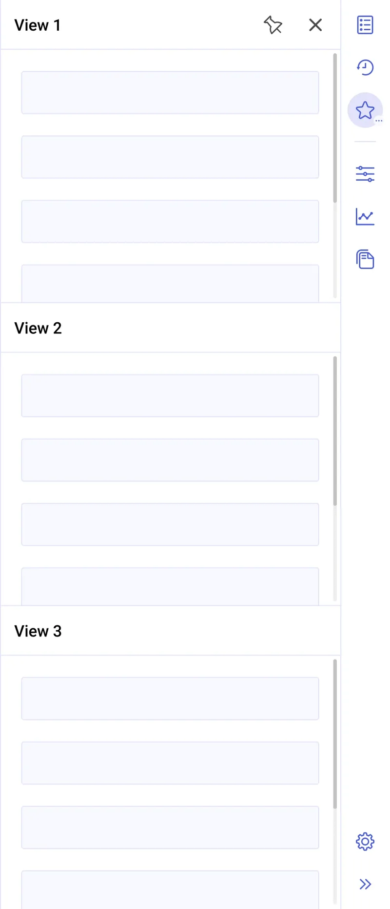
Power users also got a proper split panel: several views open at once, stacked in a single panel. On the toolbar, a split panel is represented by the icon of its top view, with a dots indicator showing there are more views inside. Before, splitting was only possible when multiple views got pinned — their icons disappearing from the toolbar one by one — a very convoluted path. Now splitting is always available, and the result saves into toolbars layouts like everything else.

Organizing the data table
Sales orders lists in CEE can return thousands of results, and the legacy Sales orders list exposed a lot of filters at once, permanently occupying a large part of the screen:
The redesigned list had already improved on this: only the most-used filters stay visible, and the rest moved into a More filters panel.

I took it a step further. Multi-column sorting and grouping are just as much about organizing the table’s data as filters are — so I brought them into the same panel, one place for all of it: the table data organization panel.

The panel brings the table’s data organization options into one predictable place, structured into three tabs:
Filters: the full filter set, grouped into collapsible sections.
Groups: grouping of table rows by chosen attributes — a way to turn a flat list of a thousand orders into a structured overview.
Sorting: multi-column sorting, so users can express rules like “by status, then by creation date” instead of being limited to a single column.


In the old version, sorting and grouping were squeezed into one modal, opened from the table toolbar. Checking a column on the left added it to the list on the right — as either a sort or a grouping rule. Switching a rule between sorting and grouping was hidden behind icon dropdowns in the toolbar. Both functions lived in one list, their state was barely visible, and every change took several clicks on unlabeled icons. Neither user-friendly nor intuitive:

In the new panel, each grouping and sorting rule is a separate, draggable item. The order of the rules matters — the table is grouped or sorted by the first one, then the next — and users can change it by simply dragging a rule up or down. Every rule can be removed with a single icon button, and in sorting, the sort direction is switched right in the row.

Navigating linked documents
An ERP document never lives alone — a sales order produces deliveries, picking orders, invoices, etc. CEE showed this chain in a dedicated panel, called Voucher references chain in the old version:

Like much of the old interface, it was old-fashioned and unintuitive. To see the linked documents of a document, the user had to select it in the list and then click refresh inside the panel:

Switching between the linked documents of the whole document and those of a single item required yet another step — picking the right option from the refresh split button. Its icon didn’t communicate its function well, and the menu options, like Update order reference chain for line item, were long and hard to understand:

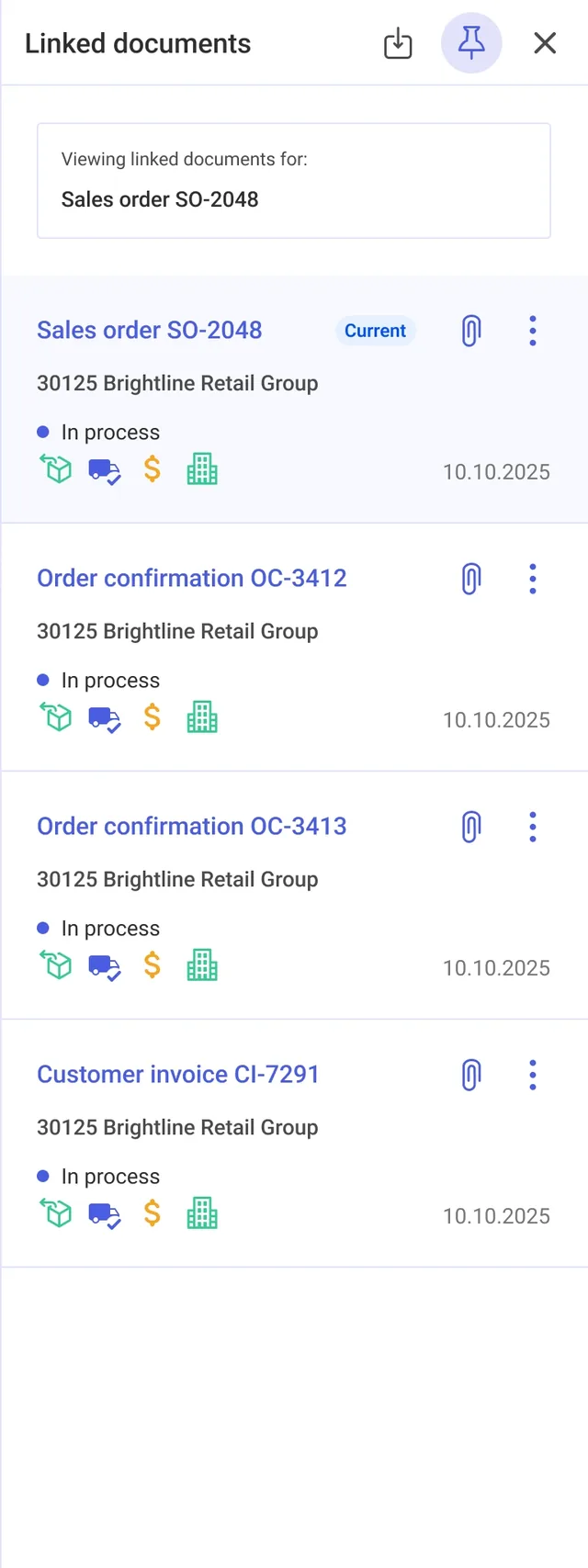
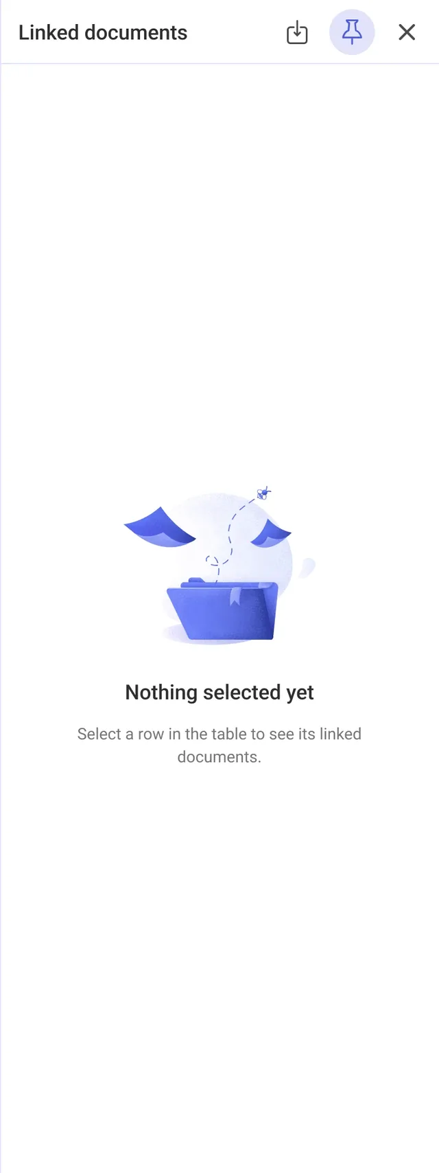
I redesigned it as the Linked documents panel. Now, just selecting a document or an item in the list automatically shows its linked documents — no refresh needed. The panel also got a modern, cleaner UI in line with the Comarch Design System: every document in the chain became an easy-to-scan card, with the currently open document explicitly marked. And when nothing is selected yet, a new empty state — missing in the old panel — tells users how to get started:
When an item is selected, the panel header clearly states that it shows data for that item — and vice versa for the whole document — so users always know what they’re looking at:
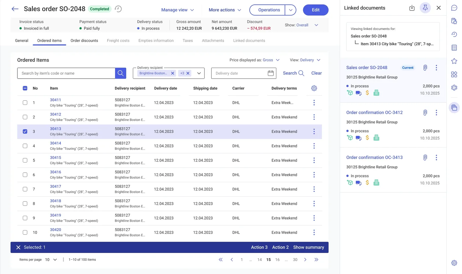
When the panel is unpinned, selection doesn’t drive it. Instead, a row action — Show linked documents — opens the panel for that row:
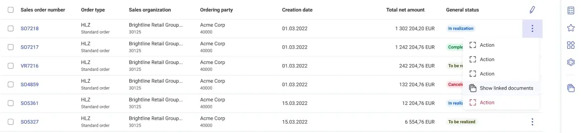
Together, these changes turned the panel from a tool users had to operate into one that simply follows their work: select a document or an item, and its whole chain is right there.
Outcomes
The Sales Orders redesign was eventually dropped, so my designs never reached customers. What remained was a complete, documented design: a consistent set of rules for the panel system, two redesigned panels, and a specification ready for designers and developers to build from.
Even without a release, the project let me work on real problems of a large, mature product — and design a system of behaviors, not just individual screens.
Lessons learnt
Density is a feature, not a bug
Working on a system for professional daily users taught me to respect information density. The goal was never to simplify CEE into a consumer app — it was to make its density navigable: predictable panels, clear hierarchy, and progressive disclosure instead of fewer capabilities.
A specification is a designed product too
The biggest part of this project was not drawing panels — it was writing the rules: edge cases like split panels, what a toolbar layout remembers between sessions, or how organization-wide layouts propagate to users. I learned to write specs that designers and developers can quickly understand and act on.
Design also means convincing people
The other designer and I were pushing for the redesign while most colleagues were used to the old system and skeptical of any changes. A big part of the work was explaining and defending our decisions — showing the problems with concrete examples and why the changes were needed. I learned that good design is not enough on its own: you also have to win people over.
Note: Some decorative visuals in this case study were AI-generated for presentation purposes.